Logo Timeline · 1976–Present
The Newton Logo
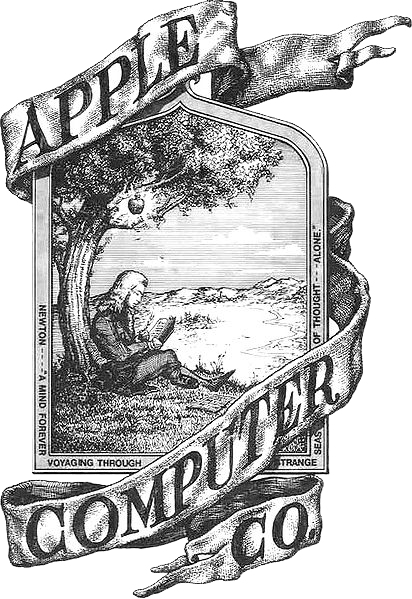
Co-founder Ronald Wayne designed this ornate engraving of Isaac Newton sitting beneath an apple tree — a direct nod to the legend of gravity. A ribbon read "Newton... A Mind Forever Voyaging Through Strange Seas of Thought... Alone." Used only on the Apple I, it was replaced within a year.
- Designed by Ronald Wayne, the rarely-discussed third Apple co-founder
- Used only on the Apple I computer — retired after a single product
- Steve Jobs felt it was "too cerebral" and too complex to reproduce at small sizes
It's too cerebral. I want something simpler — something you could reproduce in a single color and still recognize.
Steve Jobs, on the Newton logo · as recounted in Walter Isaacson, Steve Jobs (2011)
I drew it in pen and ink. I thought it was beautiful. I had no idea it would be retired in a year.
Ronald Wayne, Apple co-founder and logo designer · interview, Cult of Mac (2011)
The Rainbow Apple
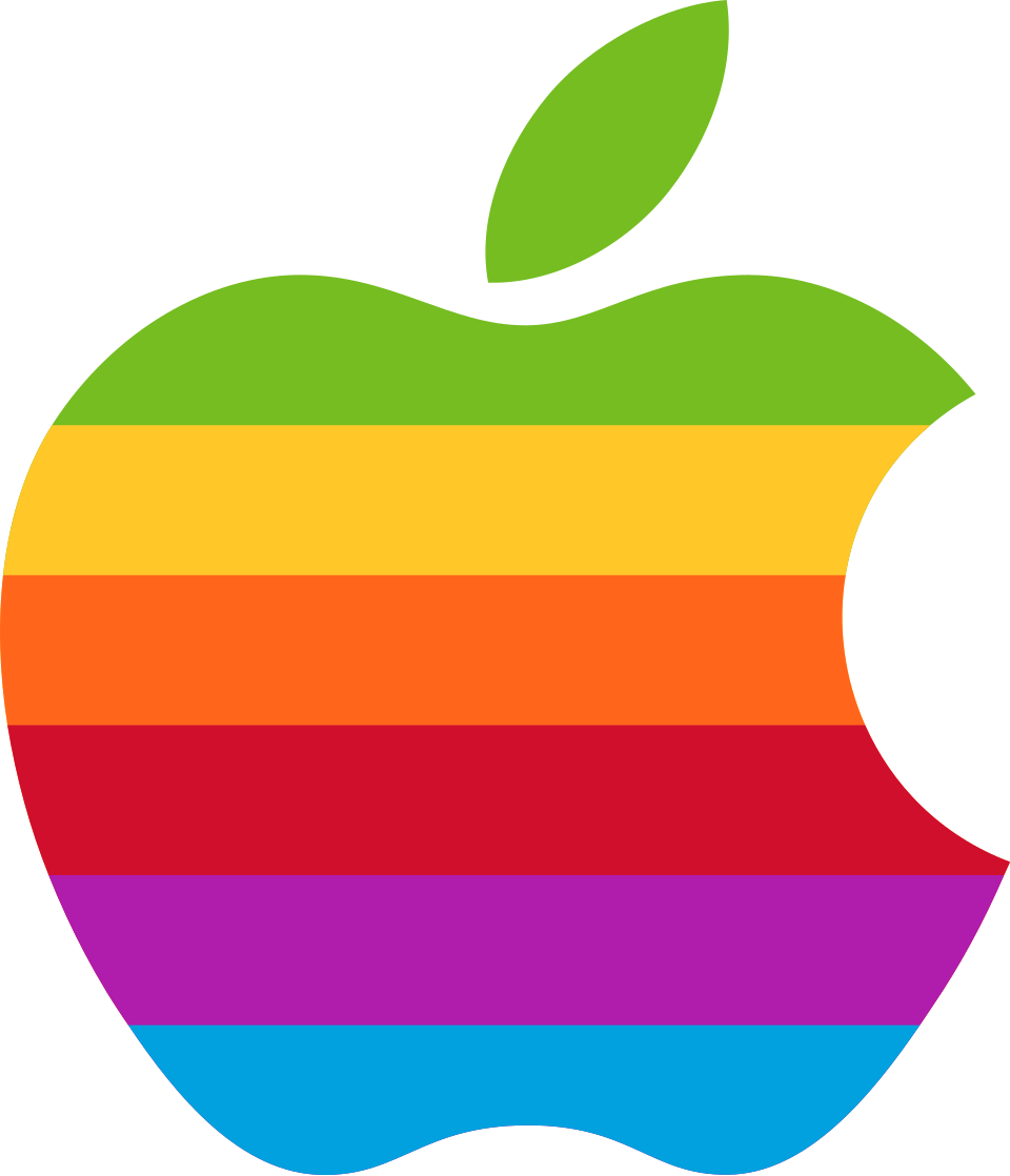
Rob Janoff was paid approximately $2,000 to design a logo for the Apple II. The bitten apple (the bite added to distinguish it from a cherry) was given six horizontal color stripes chosen to represent the Apple II's color display capability. Steve Jobs insisted on the rainbow stripes despite added printing costs. Used for 22 years.
- The "bite" was added so it read as apple, not a tomato or cherry
- Stripe order didn't follow the visible spectrum — green was on top because that's where the leaf was
- One of the most recognized corporate symbols in history — used for 22 years until Jobs' return
- Became a symbol of LGBTQ+ tech community, though that was never the original intent
I designed it with a bite out of it so people would know it was an apple — not a cherry or a tomato. The colors were chosen because the Apple II could display color. That's it. No hidden meaning.
Rob Janoff, logo designer · interview with Logo Design Love (2009)
The multicolored logo is expensive to print. It's going to add cost to every piece of paper we print, every product we ship. I want to think about that carefully.
Mike Markkula, Apple chairman and early investor · as recounted in Isaacson, Steve Jobs (2011). Jobs overruled him.

Monochrome Era Begins
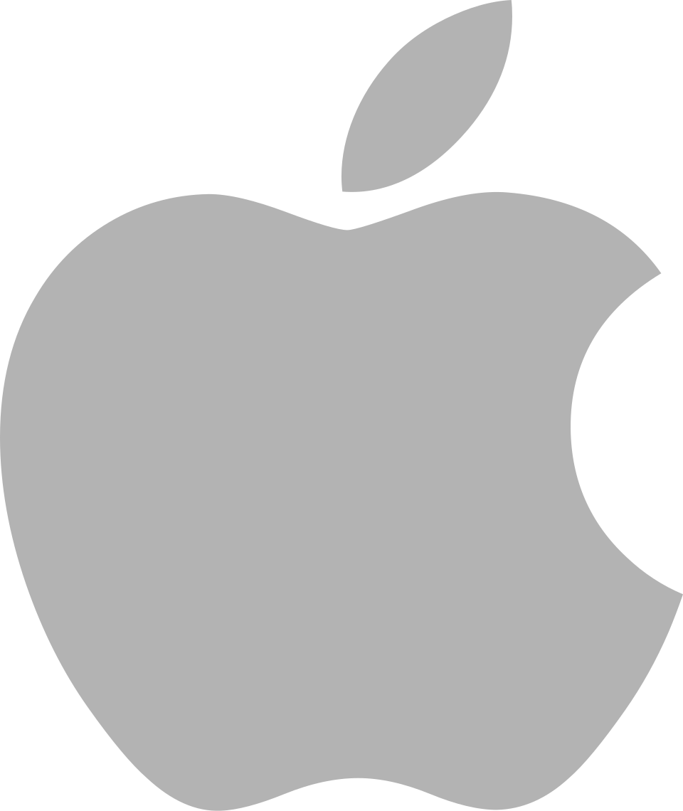
When Steve Jobs returned to Apple in 1997 and launched the iMac in 1998, the rainbow logo was quietly retired. The monochrome apple — in solid black or white depending on context — signaled a company reborn: austere, confident, no longer needing color to prove its creativity.
- No formal announcement — the rainbow simply stopped appearing on new products
- The Bondi Blue iMac G3 (1998) was the first major product to ship without the rainbow
- Coincided with the "Think Different" campaign — Apple's most celebrated advertising
- The monochrome form works on any surface — white on dark, dark on light
They didn't kill the rainbow apple. They let it retire gracefully. There's a difference. The new logo wasn't a repudiation of what came before — it was the same symbol grown up.
Steven Heller, design critic · Print Magazine (1998)
Twenty-two years of the rainbow, and it goes out without a press release? At least give the thing a funeral.
Émigré Magazine, design culture journal · reader letters (1998)

Chrome / Aqua Treatment
With OS X's "Aqua" interface and the aluminum PowerMac G4, Apple began rendering its logo in a chrome/metallic treatment matching its hardware aesthetic. The shape remained identical — only the finish changed. The glowing white Apple logo on laptop lids became an iconic status symbol through the 2000s.
- No new logo was designed — the monochrome form was recolored to match product materials
- Different product lines used different finishes: silver for laptops, black for Mac Pro
- Apple never officially released brand guidelines showing the chrome treatment — it simply appeared
The glowing Apple on the back of the PowerBook is the most coveted status symbol in any coffee shop in America. You don't need to see the brand name. You see the light, and you know.
Paul Kunkel, AppleDesign: The Work of the Apple Industrial Design Group (2004)
The chrome treatment was great on aluminum. On a white plastic iBook it looked like a sticker from a different product.
John Gruber, Daring Fireball (2002) — noting inconsistency across the product line
Pure Flat Monochrome
iOS 7 (2013) marked Apple's decisive shift to flat design under Jony Ive's combined hardware and software leadership. The logo shed any remaining gradient, becoming a pure flat shape. Today it appears in black, white, or matched to any product color — always the same silhouette, always optimized for the surface it occupies.
- The silhouette itself has not changed since 1977 — only surface treatments have evolved
- Apple's brand guidelines allow it in any single color — it's a pure form, not a specific color
- One of very few logos that functions without any wordmark — universally recognized from shape alone
Jony Ive has jettisoned years of visual richness in favor of a stark, cold aesthetic that feels more like a hospital than a computer. iOS 7 is a rebuke to everything Apple built under Jobs.
Don Norman, UX design pioneer and author of The Design of Everyday Things · Fast Company (2013)
Flat design isn't a trend. It's a correction. We spent a decade dressing software up to look like physical objects that no longer exist. Now we're letting it be what it actually is.
Khoi Vinh, former design director, NYTimes.com · Subtraction.com (2013)