Logo Timeline · 1924–Present

International Business Machines
In 1911, a merger of three companies — the Computing Scale Company, the Tabulating Machine Company, and the International Time Recording Company — created the Computing-Tabulating-Recording Company. Thomas Watson Sr. became general manager in 1914. In 1924, Watson renamed the company International Business Machines, a name grand enough to accommodate whatever the company might become. Early logos were utilitarian wordmarks — functional identifiers for a company that was still defining what it sold. The design ambition came later.
- IBM's founding trinity: punch-card tabulators, industrial scales, and employee time clocks — not computers
- Thomas Watson Sr.'s renaming to "International Business Machines" in 1924 was aspirational — the company had no international operations at the time
- Watson's famous motto — "THINK" — appeared on signs in every IBM office from 1915 onward, decades before it became a laptop brand
- IBM's early identity: conservative, masculine, institutional — designed to earn the trust of corporate clients, not consumers
THINK.
Thomas J. Watson Sr., IBM chairman · company motto adopted 1915. Watson had the single word painted on signs and placed in every IBM office worldwide. It later became the name of IBM's AI system and a line of ThinkPad laptops.

Paul Rand Arrives
In 1956, Thomas Watson Jr. — having inherited IBM from his father and committed to making the company a design leader — hired industrial designer Eliot Noyes as corporate design consultant. Noyes, in turn, brought in Paul Rand to redesign the IBM logo. Rand created a bold, solid letterform based on the City Medium typeface: three letters of equal weight, geometric and machined, radiating the confidence of a company that made the infrastructure of the industrial world. No decoration. No tagline. Just "IBM" in letters that felt like they were cut from steel.
- Thomas Watson Jr. believed design was a business imperative, not a luxury — he said "good design is good business" and meant it as corporate strategy
- Eliot Noyes restructured IBM's entire design language: buildings, products, interiors, printed materials — Rand's logo was one piece of a total system
- Rand's IBM work established him as the first American graphic designer to be taken seriously as a corporate strategist, not merely an illustrator
- The City Medium letterforms were chosen for their geometric clarity and weight — they read as technological and permanent
Good design is good business.
Thomas J. Watson Jr., IBM chairman · lecture at the Wharton School, University of Pennsylvania (1973). Watson used this phrase to argue that investment in design was a competitive advantage, not an aesthetic indulgence. The phrase became one of the most quoted statements in the history of corporate design.
The role of the designer is not to impose ideas but to express them — to find the visual language that makes a complex organization legible, permanent, and unmistakable.
Paul Rand, designer · A Designer's Art (1985). Rand's four-decade relationship with IBM produced not just a logo but an entire visual language that influenced corporate design for a generation.

The Stripes — 13 Bars
Four years after his initial IBM logo, Rand returned with a dramatic refinement: he cut the solid letterforms into horizontal stripes. The reasoning was elegant — the stripes implied speed, movement, and dynamism. They transformed static letterforms into something kinetic. They also created a practical benefit: the striped logo reduced ink consumption on printed materials and performed better on the early cathode-ray screens IBM was beginning to manufacture. Rand presented thirteen stripes in the first version. IBM adopted it. The age of the striped IBM logo had begun.
- The stripe concept converted static letterforms into something that implied motion — the logo read as a process, not just a mark
- Thirteen stripes in the first version; twelve years later Rand proposed a refinement to eight — with the argument that fewer, bolder stripes read more cleanly at small sizes
- IBM's executives initially resisted the stripes, finding them overly decorative; Rand's famous response was that the alternative was to go back to a plain wordmark, which he declined to do
- The striped logo coincided with IBM's domination of the mainframe computer market — the System/360, launched in 1964, ran under the 13-stripe mark
The stripes are not decoration. They suggest speed, they suggest efficiency, they suggest the future. They transform three letters into a system. A logo without meaning is just a nameplate; this logo is an argument.
Paul Rand, on the stripe treatment · internal IBM design presentation, circa 1960, later published in Paul Rand: A Designer's Art (Yale University Press, 1985)
IBM under Watson Jr. wasn't the first technology company to take design seriously — but it was the first to build design into its corporate charter. When Rand showed up, the logo wasn't the product. The logo was the philosophy.
Steven Heller, author of Paul Rand (Phaidon, 1999) · lecture on postwar corporate identity, AIGA National Conference (2001)
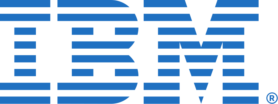
Eight Stripes — The Final Form
In 1972, Rand returned to IBM with a proposal: reduce thirteen stripes to eight. The argument was precision engineering applied to typography — fewer stripes meant bolder individual lines, which meant the logo held together at smaller sizes, on early digital screens, and on the badges and nameplates that IBM affixed to its products. Rand presented the refinement not as a redesign but as a correction: the logo arriving at the form it had always been heading toward. IBM adopted it. It has not changed since. Over fifty years later, the eight-stripe IBM logo remains one of the most recognized corporate marks in the world — proof that the right answer, reached carefully, doesn't need to be revisited.
- The 8-stripe logo has been IBM's primary mark since 1972 — over 50 years without modification
- Rand's argument for fewer stripes: each horizontal line needed to be bold enough to hold at small sizes; 13 stripes became optically muddy below a certain scale
- IBM has maintained Rand's visual system — typeface, color (Pantone 2718), proportions — across billions of products and communications
- The 1981 "Eye Bee M" rebus poster by Rand (eye, bee, M) is one of the most celebrated pieces of corporate communication ever produced — IBM used it as an internal motivational poster
- When Steve Jobs hired Rand for NeXT in 1986, Jobs asked for logo options. Rand reportedly said: "I'll solve your problem and charge you $100,000. You don't have to use it." Jobs used it.
Eight stripes work where thirteen did not — at every size, on every surface, in every reproduction technology that exists or might exist. The logo has to work on a badge worn by a technician and on the side of a building. Eight stripes do both. Thirteen strained.
Paul Rand, presenting the 8-stripe refinement to IBM leadership · internal design brief, 1972, excerpted in Paul Rand: His Work from 1946 to 1996 (Monacelli Press, 1997)
I asked Paul if he could come up with some options for the logo. He said: 'No. I will solve your problem, and you will pay me. You don't have to use the solution. If you want options, talk to someone else.' That was Paul Rand.
Steve Jobs, recounting his 1986 engagement with Paul Rand to design the NeXT logo · interview with Gary Wolf, Wired magazine (1996). Jobs paid $100,000 for a single logo solution — and used it without change.
The IBM logo endures not because it's beautiful, though it is, but because it has never tried to be anything other than what it is. Rand built a mark so complete that every subsequent designer's instinct has been to leave it alone.
Michael Bierut, designer and Pentagram partner · foreword to Paul Rand (Phaidon Press, 1999)