Logo Timeline · 1964–Present

Before Nike Was Nike
Phil Knight and Bill Bowerman founded Blue Ribbon Sports in 1964 as a distributor of Onitsuka Tiger shoes from Japan. Knight was an accounting instructor at Portland State; Bowerman was Oregon's legendary track coach. The name was invented on the spot — Knight was in Japan negotiating a contract with Onitsuka's executives and needed something to put on the paperwork. He wrote down "Blue Ribbon Sports." Generic, safe, and completely disconnected from any idea about athletics, speed, or victory. The logo matched: a stylized BRS monogram with interlacing letters, functional enough, telling you nothing.
- Knight's first shipment was 300 pairs of Tiger Cortez running shoes, sold out of the trunk of a car at track meets
- The name "Nike" came from Jeff Johnson — Nike's first full-time employee — who dreamed of the Greek goddess of victory the night before the company needed to file new incorporation papers in 1971
- Knight's preferred alternative was "Dimension 6" — Bowerman liked "Falcon." Johnson's suggestion won by default
- Blue Ribbon Sports was incorporated in Oregon in 1964; the company officially became Nike, Inc. in 1978
I came up with a name on the fly. The Japanese wanted a company name on the contract. I said "Blue Ribbon Sports." I don't know why. It was the first thing I thought of.
Phil Knight, Nike co-founder · Shoe Dog (2016)
Nike. The Greek goddess of victory. Six letters. I don't love it. But I don't hate it. Let's go with it.
Phil Knight, Nike co-founder · on Jeff Johnson's name suggestion, 1971 · Shoe Dog (2016)
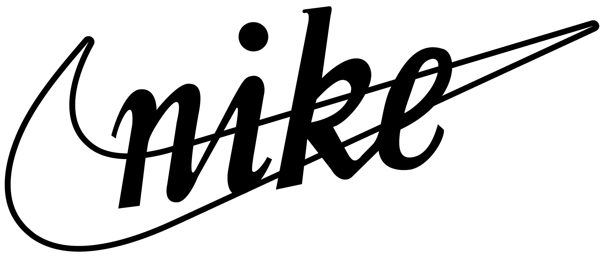
The Original Swoosh + Script
Portland State University student Carolyn Davidson was paid $35 to design a logo for what was then Blue Ribbon Sports. Phil Knight wanted something that conveyed motion. Davidson created the Swoosh — a wing of the Greek goddess Nike — in a matter of hours. Knight famously said "I don't love it, but it'll grow on me."
- Carolyn Davidson was paid $35 for one of the most valuable logos ever created
- Phil Knight later gave Davidson 500 shares of Nike stock and a diamond ring in 1983 as belated gratitude
- The name "Nike" wasn't adopted until 1978 — the company launched as Blue Ribbon Sports
- The original stroke was thicker and more hand-drawn than later refinements
I don't love it. But maybe it'll grow on me.
Phil Knight, Nike co-founder · on first seeing the Swoosh, 1971. Recounted in Shoe Dog (2016)
I knew I'd designed something when I handed it over. I didn't know it was going to be that something.
Carolyn Davidson, Swoosh designer · interview, Oregon Live (2011)

Bold Sans-Serif Wordmark
As the company officially adopted the Nike name and expanded internationally, the italic script gave way to a bold, capitalized sans-serif "NIKE" — authoritative, athletic, unmissable on jerseys and shoes. Nike's revenues grew from $14M in 1976 to $920M by 1983.
- The switch to all-caps reflected a more assertive brand personality as Nike began outspending rivals
- This version appeared on the iconic Air Force 1 (1982) and Air Jordan 1 (1985)
- The Swoosh itself was subtly thinned and made more geometric during this period
Nike is doing something very smart — they're not hiding the Swoosh behind the name anymore. They're putting the name behind the Swoosh.
Advertising Age · trade coverage of Nike's 1978 identity update
The all-caps NIKE with a Swoosh is about as bold as it gets for a sports brand. Whether that's confidence or shouting, I haven't decided.
Communication Arts · design annual commentary (1980)

NIKE in a Black Box
Through the late 1980s, Nike's dominant applied mark was the bold NIKE wordmark set against a solid black rectangle — high-contrast, unapologetic, built for shoe boxes, hang tags, and apparel labels. This is the era in which Nike became a cultural institution: "Just Do It" (1988), Michael Jordan, the Air Max. The logo didn't need a Swoosh in it to carry that weight — the wordmark alone had become shorthand for the entire company.
- "Just Do It" was created by Dan Wieden of Wieden+Kennedy in 1988, inspired by the last words of a convicted murderer — and became one of advertising's most enduring lines
- Michael Jordan's first Nike deal (1984, $250K/year + royalties) was the largest celebrity endorsement of its time and created an entirely new category: the signature athlete shoe
- Nike surpassed Adidas as the world's largest athletic footwear brand during this period
- The black box format appeared across shoe boxes, apparel tags, and retail displays — the Swoosh was present on products but the rectangle was the dominant printed mark
Just Do It is three words. The Swoosh is one shape. Together they are a complete sentence that doesn't need a noun.
Dan Wieden, co-founder of Wieden+Kennedy, creator of "Just Do It" · Advertising Age (1998)
The box format looks dated already. The Swoosh doesn't need a container — it's strong enough to stand on its own.
Marty Neumeier, brand strategist · The Brand Gap (2003), retrospective on Nike's visual evolution

The Swoosh Alone
By the mid-90s, Nike had achieved something extraordinarily rare: a logo so recognized it no longer needed words. The company quietly dropped the "NIKE" wordmark from most primary applications. Trusting that a simple curved stroke needs no explanation is considered one of the boldest brand confidence moves in history.
- Fewer than a dozen brands in history have successfully stripped their wordmark
- Brand recognition studies consistently show 97%+ global recognition for the Swoosh
- Carolyn Davidson's $35 design is now estimated to have generated trillions in brand value
There are maybe five logos on earth that don't need a name. The Swoosh is one of them. Nike earned that in 24 years. That's extraordinary discipline.
Wally Olins, co-founder of Wolff Olins · interview, Design Week (1997)
Removing the name is a bold move — but it only works because Nike spent two decades and billions of dollars making it work first. Don't try this at home.
Al Ries & Laura Ries, The 22 Immutable Laws of Branding (1998)