Logo Timeline · 1898–Present
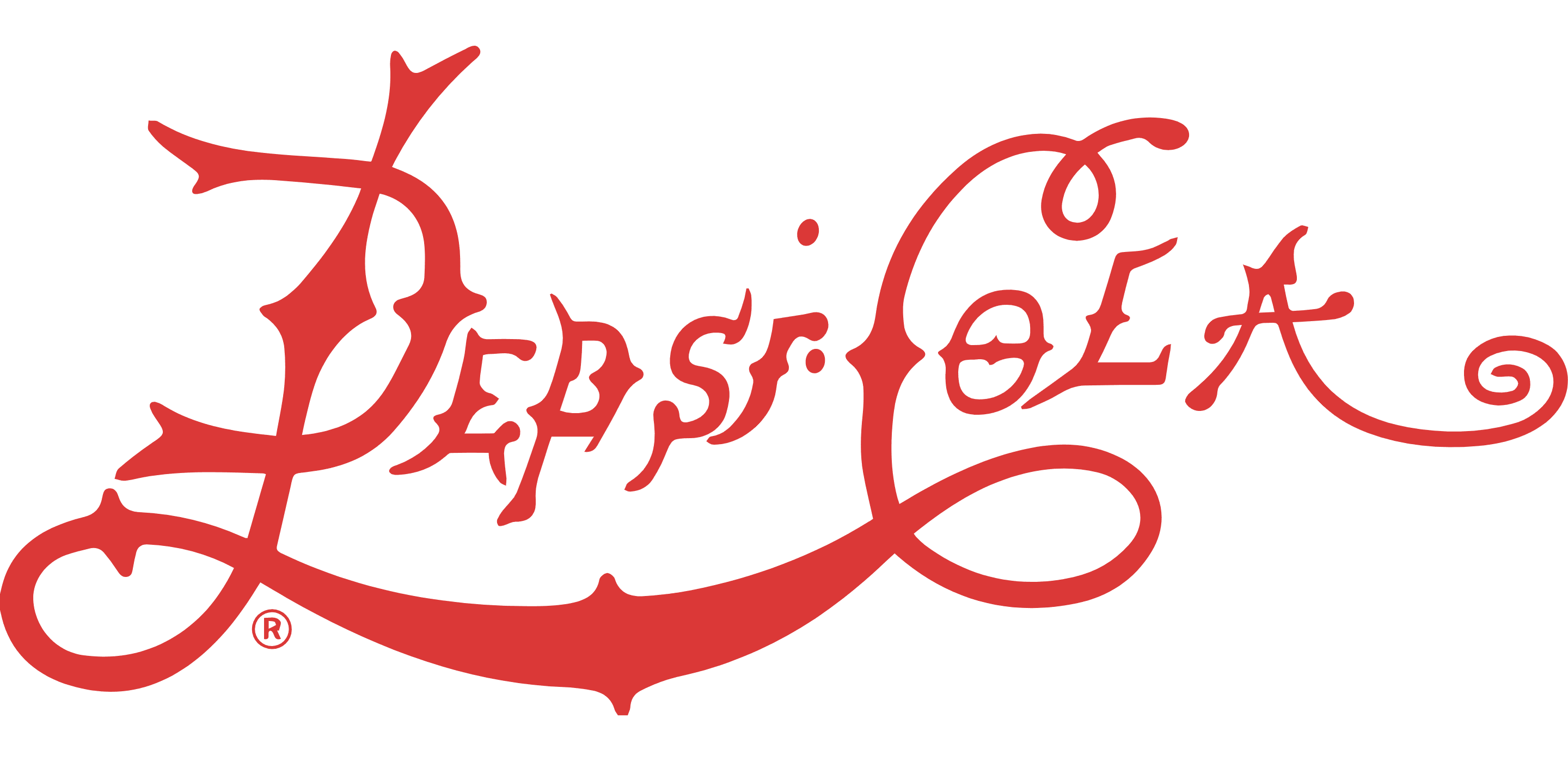
Brad's Drink / Pepsi-Cola Script
Pharmacist Caleb Bradham invented "Brad's Drink" in his New Bern, NC drugstore in 1893. Renamed Pepsi-Cola in 1898, the brand adopted an ornate red cursive script with spiky, fang-like serifs — essentially indistinguishable from Coca-Cola's visual language at the time. Both brands were marketed as health aids, both used red wavy script, and both promised digestion benefits. Pepsi's tagline was "Exhilarating, Invigorating, Aids Digestion." The script evolved through several iterations in 1905 and 1906 before settling into the more refined 1940 version.
- Originally marketed as a digestive aid, not purely a refreshment
- The script style deliberately borrowed from Coca-Cola's established visual language
- Bradham went bankrupt in 1923 after sugar prices crashed; the brand was sold and revived multiple times
Pepsi-Cola is a very good name but this script they're using looks like every other patent medicine on the shelf. They need something that stands on its own.
Trade commentary · Printers' Ink trade journal (c. 1910), on early Pepsi branding
The name had real power. It sounded modern and scientific. The logo just hadn't caught up to it yet.
Martin Mayer, Madison Avenue, U.S.A. (1958) — on Pepsi's pre-war identity struggles

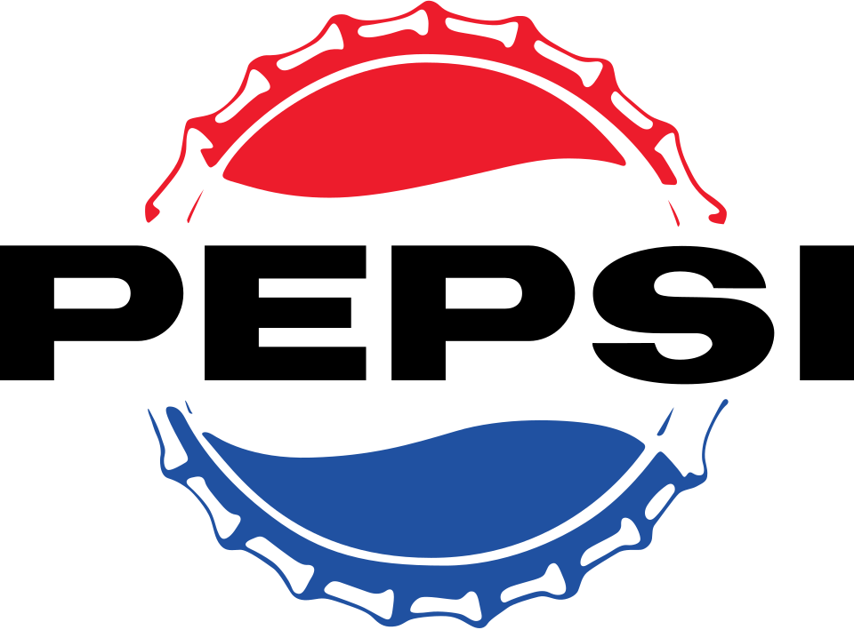
The Bottle Cap Logo
During WWII, Pepsi adopted red, white, and blue — the American flag's colors — in a patriotic bottle cap design. This was a masterstroke: it differentiated Pepsi from Coca-Cola (red only) while tapping into wartime national pride. The circular cap became Pepsi's primary mark, evolving into the globe that persists to this day.
- The color choice was explicitly patriotic — Pepsi ran ads connecting their colors to the war effort
- The bottle cap shape solved a practical problem: recognizable on physical caps before consumers could read the label
- This mark began Pepsi's 80-year relationship with the circular tricolor motif
That bottle cap was the smartest thing Pepsi ever did. Red, white, and blue on a Pepsi cap and nobody could accuse them of being un-American during the war. Meanwhile Coke just stayed red.
Thomas Oliver, The Real Coke, The Real Story (1986) — on Pepsi's WWII-era positioning
The bottle cap works because it's honest — it looks like what it is. A Pepsi bottle cap. That's not a trivial thing.
Raymond Loewy, industrial designer · cited in Never Leave Well Enough Alone (1951)
Modernist Simplification
The postwar design revolution stripped the ornate script to a clean wordmark. The bottle cap became a simplified geometric circle divided by a white wave. This version launched alongside the "Pepsi Generation" campaign — the first brand campaign to directly target youth culture over older generations.
- The "Pepsi Generation" (1963) campaign was the first to explicitly market to baby boomers as a demographic
- The wavy white line dividing red and blue became the brand's most enduring visual element
- Pepsi dropped "Cola" from its name officially in 1961, though logos remained mixed for years
The Pepsi Generation campaign didn't sell a soft drink. It sold a demographic identity. The logo had to grow up to match that ambition — and it did.
Jerry Della Femina, ad man · From Those Wonderful Folks Who Gave You Pearl Harbor (1970)
Pepsi keeps cleaning things up and ending up with something that looks almost exactly like before. What exactly are they simplifying toward?
Graphic Design: USA · industry commentary on Pepsi's 1962 revision (1963)
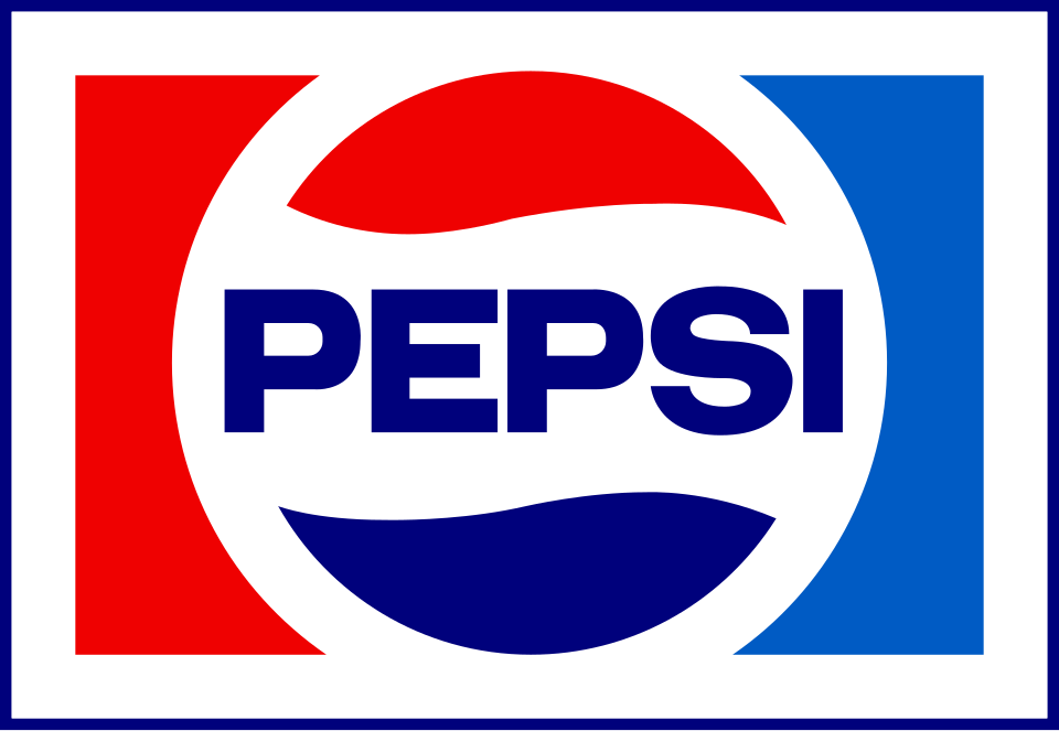
The First Globe
The circle evolved into a proper "globe" — the white wave grew more curved and swooping, pushing the red and blue areas into hemisphere-like shapes. The "Pepsi Challenge" (1975) blind taste tests launched under this mark and proved genuinely disruptive to Coke. Michael Jackson signed with Pepsi in 1983 for $5M — the largest celebrity endorsement at the time.
- The "Pepsi Challenge" (1975) proved in blind tests that more people preferred Pepsi's taste
- The globe shape subtly suggested the brand's growing international presence
- Brand revenues doubled from $1B to $2B during this period
When Pepsi proved consumers actually preferred their taste, the globe became something more than a logo — it became the mark of a brand that was willing to go on record.
Advertising Age · on the Pepsi Challenge campaign, 1975
The globe works. It's round, it's friendly, it moves. But at some point Pepsi has to decide: are we globe people or word people? You can't keep doing both forever.
Walter Landor, founder of Landor Associates · industry roundtable, Communication Arts (1981)
The "Smile" Globe — The $1M Rebrand
Design firm Arnell Group charged approximately $1 million for a logo in which the white wave became a "smile." The accompanying 27-page design brief compared it to Earth's magnetic field, the Mona Lisa, and Renaissance principles. It became the most mocked brand document in design history. The estimated total rebrand cost including packaging and signage exceeded $1 billion.
- The Arnell Group's design rationale document leaked online and went viral for its pseudoscientific claims
- Each Pepsi variant had a differently-tilted white arc — a system few consumers ever noticed
- Design critics widely condemned the change as unnecessary and hard to distinguish from the previous version
- Pepsi's market share continued to decline against Coke throughout this logo's lifespan
The Pepsi smile is driven by earth's magnetic field declination... The gravitational pull is determined by the ratio of the tilt and the smile, referencing the Vitruvian Man, the Mona Lisa, and the Golden Ratio.
Peter Arnell / Arnell Group, "Breathtaking Design Strategy" (2008) · the leaked 27-page rationale document for a logo that cost approximately $1 million
I can't tell if this is brilliant or the most expensive nothing in the history of graphic design. Compared to the old one, it's… slightly different. A billion dollars later.
Armin Vit, founder of Brand New / UnderConsideration · coverage of the 2008 Pepsi rebrand
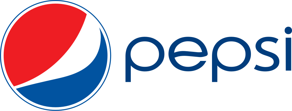
Retro-Forward Rebrand
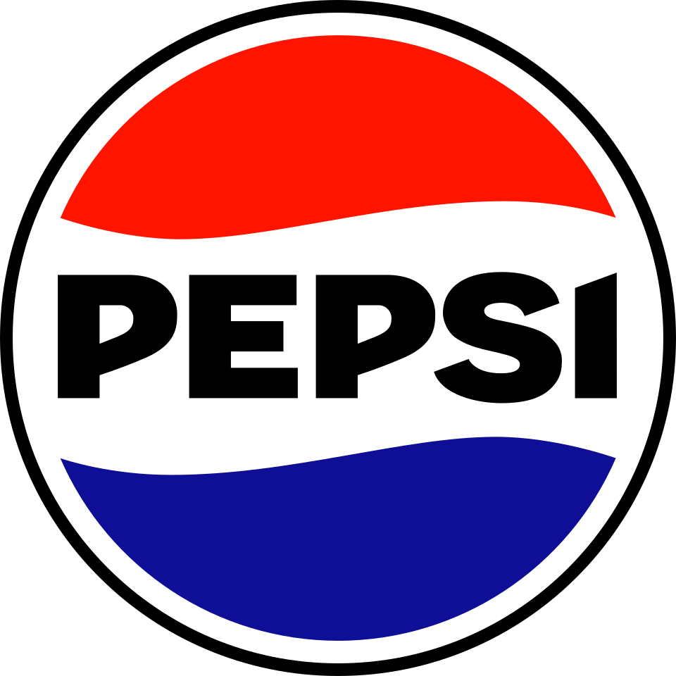
For Pepsi's 125th anniversary, the brand launched its most dramatic overhaul in decades. The globe kept its blue and red halves but the white stripe went wavy again — a direct callback to the 1940s bottle cap that started it all. The wordmark switched from the 2008 lowercase to bold, all-caps black lettering with a retro 1960s feel. Electric blue entered as a vibrant accent. The wavy stripe and black type together read as "heritage with energy" — and the design community broadly praised it as the first Pepsi rebrand in years that felt genuinely committed.
- The wavy white stripe is a direct throwback to the 1940s bottle cap — Pepsi's most beloved era of design
- The all-caps black wordmark deliberately echoes 1960s Pepsi typography, nodding to the "Pepsi Generation" era
- Electric blue was introduced as a new accent color for digital-first applications
- Launched alongside Pepsi's 125th anniversary and a renewed push to reclaim youth culture
This is the first Pepsi rebrand in 15 years that feels like it was done with conviction rather than committee. The black is bold, the type has personality. It looks like a brand that actually believes in itself.
Debbie Millman, host of Design Matters · on the 2023 Pepsi rebrand
I appreciate the ambition. But black Pepsi feels like Pepsi trying to be something it isn't. It's a summer drink. It should look like summer.
Consumer feedback summary · YouGov brand perception polling, Q2 2023, cited in Marketing Week