Logo Timeline · 1961–Present

Haloid Becomes Xerox
The Haloid Photographic Company had spent decades selling photographic paper before physicist Chester Carlson's "electrophotography" process — licensed in 1947 and rechristened "xerography," from the Greek for "dry writing" — turned it into something else entirely. The 1959 launch of the Xerox 914, the first plain-paper office copier, was a sensation: revenue nearly doubled between 1959 and 1961. The company renamed itself Xerox Corporation in 1961 and commissioned Lippincott & Margulies for a logotype to match its new ambitions — an elegant serif wordmark with elongated, curved strokes on both X's, a world away from the plain "Haloid" nameplate it replaced.
- Chester Carlson made the first xerographic image in 1938, in a rented room above a bar in Queens, NY — it took Haloid until 1959 to bring the technology to market as the 914
- The 914's live television debut, September 16 1959 at Manhattan's Sherry-Netherland Hotel, was a calculated gamble — it worked, and the company was renamed Haloid Xerox in 1958, then simply Xerox Corporation in 1961
- "Xerox" derives from the Greek xeros (dry) and graphein (writing) — the company later fought a decades-long trademark battle to keep "xerox" from becoming a generic verb
- Lippincott & Margulies' 1961 serif logotype was the first Xerox wordmark, not the electronics-company sans-serif the brand is remembered for today
Sometimes my boss asks me which is the original, and sometimes, I don't know.
Xerox 914 television commercial, 1959 launch campaign. The ad's premise — a copy indistinguishable from the original — became the plain-paper copier's entire sales pitch, and Haloid Xerox's revenue nearly doubled within two years.
Chermayeff & Geismar Straighten the Line
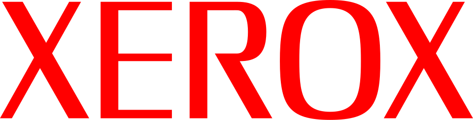
Seven years after the Lippincott logotype launched Xerox as an independent brand, Tom Geismar of Chermayeff & Geismar was brought in to sharpen it. The ornate curved serifs were squared off into a custom angular serif, the palette switched to a confident red and white, and the "R" was opened up for better legibility at a distance. The result held for forty years — through the rise of the photocopier as an office fixture, the company's brief run as a computing pioneer at PARC, and the long decline of its core paper business — making it one of the longest-serving corporate wordmarks of the twentieth century.
- Chermayeff & Geismar (later Chermayeff & Geismar & Haviv) built one of the most decorated corporate identity practices of the era — Xerox joined a client list that came to include Mobil, NBC, and PBS
- The 1968 mark removed the 1961 logo's curved, elongated serifs in favor of a squarer, more angular custom serif
- Red and white became Xerox's signature palette for the next four decades, running unchanged through the company's most consequential era: PARC's invention of the GUI, the mouse, and Ethernet in the 1970s
- The 1968–2008 wordmark outlasted three CEOs and the entire rise and plateau of the office photocopier as a category

The Shiny Ball
On January 7, 2008, Xerox unveiled its first full identity overhaul in forty years — a lowercase "xerox" wordmark in red, paired with a sphere-shaped symbol built from interlocking lines meant to form an illustrative "X." Interbrand designed it to signal that Xerox had moved past its reputation as a copier company into software and services, and to animate cleanly across the digital platforms print identity systems hadn't needed to worry about in 1968. The reaction from the design press was immediate and almost uniformly hostile — a rare case of a rebrand becoming a professional cautionary tale even as the underlying business strategy behind it was broadly accepted.
- Designed by Interbrand to mark Xerox's shift from "the copier company" into software, services, and document management
- The sphere was built from linked strokes intended to read as an "X" while animating smoothly across screens — a concession the 1968 print-only mark never had to make
- Brand New (UnderConsideration) called the reaction "overwhelmingly negative" — reportedly not one commenter defended the redesign in the comment threads
- Despite the design backlash, the strategic repositioning behind it proved durable — Xerox spent the following decade and a half continuing to diversify beyond hardware, culminating in the 2025 Lexmark acquisition
We're strengthening our attributes and giving our brand a contemporary look that is more relevant for business today — a bit less formal, a lot more lively, with links to our heritage and a nod to the future.
Ursula Burns, then-president of Xerox · company statement accompanying the January 2008 rebrand launch
This gives branding a bad name, and drags us all down with it.
Reader comment, Brand New (UnderConsideration) · comment thread on the January 2008 Xerox rebrand post, one of dozens of critical responses and reportedly not a single defense of the redesign

The Next Phase
Xerox completed its $1.5 billion acquisition of Lexmark on July 1, 2025, combining two of the last major independent printing and imaging companies into one. Announced June 9, 2026, the refreshed identity keeps the sphere concept the 2008 mark introduced but rebuilds it as a cleaner, more confidently animated mark — Xerox's attempt to signal that a company built on physical paper machines is still relevant in an era of AI-driven workplace software. Whether the market treats this as a real repositioning or a defensive rebrand after a shrinking core business remains, as with most consolidation-driven identity refreshes, an open question.
- Announced June 9, 2026, following the July 2025 completion of Xerox's $1.5 billion acquisition of Lexmark
- Xerox CMO Darren Cassidy described it as "a clear step into the next chapter," framing the identity around greater capability, scale, and simplifying complex operations
- The company positions the merged Xerox-Lexmark identity around "imaging, software and workplace services" — explicitly moving the brand narrative away from "printer company"
- This is the fourth distinct Xerox wordmark era in 65 years, and the first driven by acquisition rather than a standalone strategic repositioning
This evolution of the brand logo reflects the combined strengths of Xerox and Lexmark and reinforces our commitment to delivering greater value, expanded capabilities, and stronger outcomes for our clients and partners.
Xerox Corporation, official statement accompanying the June 9, 2026 brand identity announcement
A clear step into the next chapter.
Darren Cassidy, Chief Marketing Officer, Xerox · company announcement, June 2026