The most common form of client resistance to a rebrand isn't concern about the new direction. It's an emotional attachment to the existing mark that manifests as "our logo is who we are." This belief, while understandable, is almost always historically incorrect.
Every logo that exists today replaced something that came before it. The mark a client feels is inseparable from their identity was itself, at some point, a bold departure from what customers had known. Someone in a boardroom, at some year, made a decision very much like the one you're proposing now — and the brand didn't collapse. It adapted. Often, it improved.
The clients who understand this are easier to work with, make better decisions, and produce better outcomes. The ones who don't tend to produce logos by committee, compromise every decision toward the existing mark, and end up with rebrands that deliver neither the safety of the old nor the opportunity of the new.
"No brand has always had its logo. Every mark you see on a building or a jersey replaced something else. The question isn't whether to change — it's whether to change on purpose."
Pattern 03 — The Case for ChangeThe fear underneath the resistance
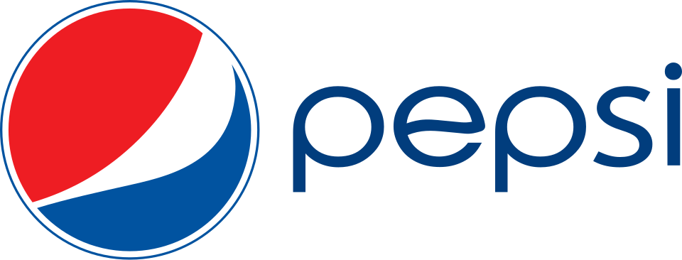
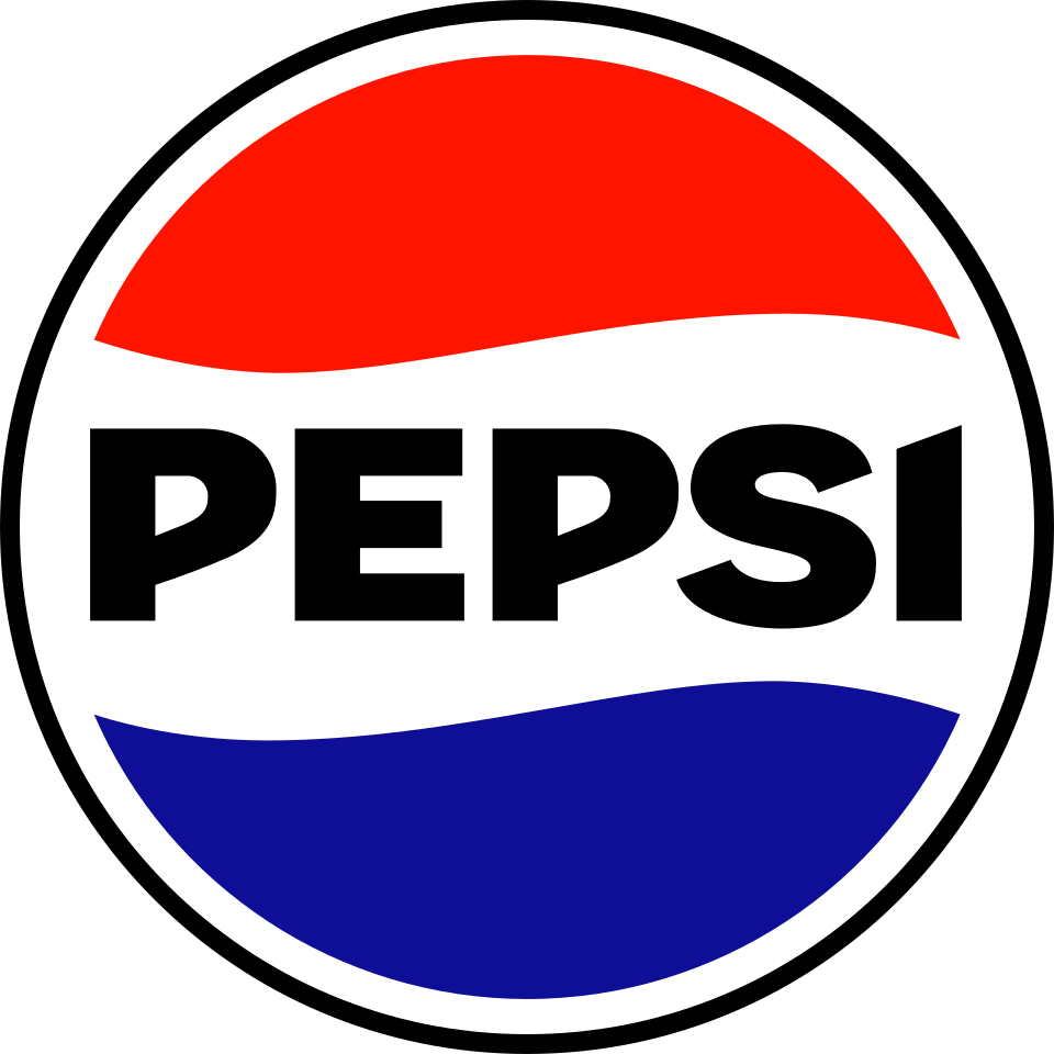
What clients are really afraid of isn't the logo change itself. They're afraid of losing the brand equity that's been built — the recognition, the trust, the associations customers have formed. This is a legitimate concern. It's also different from the logo itself. Brand equity lives in people's minds, not in a file. A thoughtful rebrand carries equity forward. A bad rebrand (Pepsi 2008, Gap 2010) erodes it — but the cause of erosion isn't change per se, it's change that doesn't earn its departure from what came before.
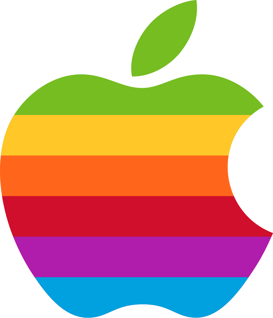
Apple in 1998 is the most useful case study here. The company was weeks from bankruptcy. Steve Jobs returned and changed nearly everything — including quietly retiring the rainbow logo that had been in use for 22 years. The fear at the time was real: would customers recognize the new Apple? Would abandoning the rainbow signal instability? Instead, the rebrand was the beginning of the greatest business turnaround in corporate history. The monochrome apple now means something the rainbow never could.
How to use this pattern in a pitch
The goal isn't to shame the client for their attachment to the existing mark — it's to broaden their frame of reference. Showing a client three brands they admire, each of which underwent a dramatic rebrand and emerged stronger, relocates the decision from "risky" to "inevitable." The brands that didn't change eventually faced the same pressure — they just changed later, less deliberately, and with less advantage.
The specific brands you choose matter. Use companies in adjacent or aspirational categories, not direct competitors. And always tie the rebrand to a business outcome — the story isn't "Apple changed their logo." It's "Apple changed their logo as part of a turnaround that created $3 trillion in value."
The key qualifier
This pattern makes the case that change is survivable — even necessary. It doesn't make the case that any change is right. The ADT shield, unchanged for 35+ years, is evidence that some marks are durable enough to hold. The skill is knowing the difference: whether the existing mark is holding back the brand, or whether it's actually doing the job so well that changing it would cost more than it gains.
Evidence · Change Survived, Often Celebrated