There is a persistent belief in the boardroom that a bigger budget means a better logo. That spending more signals seriousness, earns stakeholder buy-in, and produces something more durable. The historical record is brutal on this assumption.
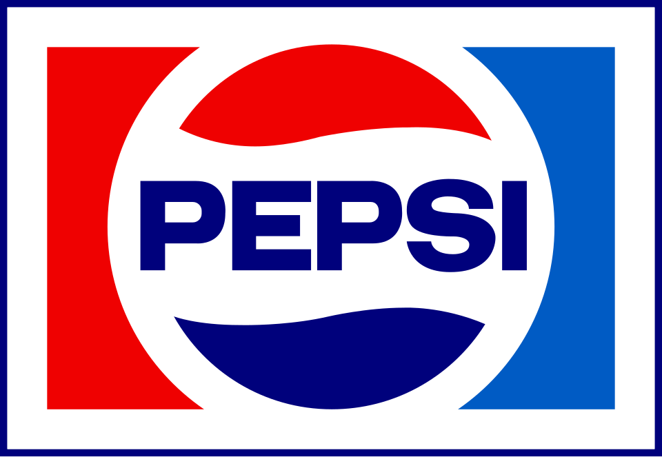
Carolyn Davidson was paid $35 in 1971 for one of the most recognizable marks in human history. The Nike Swoosh now appears on stadiums, Olympic podiums, and the chests of billions of people. It has never been replaced. Compare this to the Arnell Group's 2008 Pepsi rebrand — an estimated $1 million for the logo alone, $1 billion+ when packaging and signage are included. The design community mocked it. Market share continued to slide. The logo was quietly revised within years.
The difference isn't money. It's whether the designer found the right form. And that's a function of insight, not budget.
"Budget is not a proxy for quality in logo design. The most durable marks in history were often the ones that cost the least — because they came from clarity of thought, not layers of process."
Pattern 02 — The Cost TrapWhy expensive rebrands fail
Large rebrands involve large committees. Large committees introduce competing agendas, risk aversion, and the need to justify expenditure with visible complexity. A $1 million logo process tends to produce something that looks like it cost $1 million — layered with rationale, heavy with meaning, rich with system. But great logos aren't experienced as systems. They're experienced as instants.
The most damaging version of the Cost Trap is when an expensive rebrand produces something barely distinguishable from what it replaced — all the disruption of change, none of the benefit of improvement. This is what happened to Pepsi in 2008. The new logo was incrementally different from the 1998 version, but the process cost nine figures to execute and generated enormous internal turbulence. Consumers didn't notice. Rivals benefited.
What this means for your clients
This pattern is most useful when a client equates "taking the logo seriously" with spending more. The counterargument isn't that they should spend less — it's that the right investment is in thinking and in finding the right designer, not in scale of process. A logo doesn't get better because more people voted on it.
The other use: when a client wants to justify a major rebrand by pointing to the investment as proof of commitment. The Pepsi case is a useful check. Visible spending can actually undermine a rebrand by setting expectations the work can't meet.
The important caveat
Cheap doesn't equal good either. Carolyn Davidson produced something brilliant for $35, but Davidson was brilliant. The lesson isn't "pay designers less" — it's that the quality of the work is almost entirely decoupled from the scale of the project around it. A great rebrand can happen at any budget. A bad rebrand can happen at any budget. The variable is whether the form is right.
Evidence · Cost vs. Outcome