Walk any major brand backwards through its history and you'll notice the same thing: the older versions are more ornate, more literal, more decorated. The newer ones are stripped back. This isn't coincidence — it's a pattern that plays out across industries, eras, and continents.
The reason is partly practical. A logo that started as an illustration can't shrink to a favicon without losing everything. A logotype in an ornate Victorian script can't be embroidered on a hat, stitched on a jersey, or rendered in a single color on a dark background. Complexity is a liability that accumulates silently until a new medium makes it catastrophic.
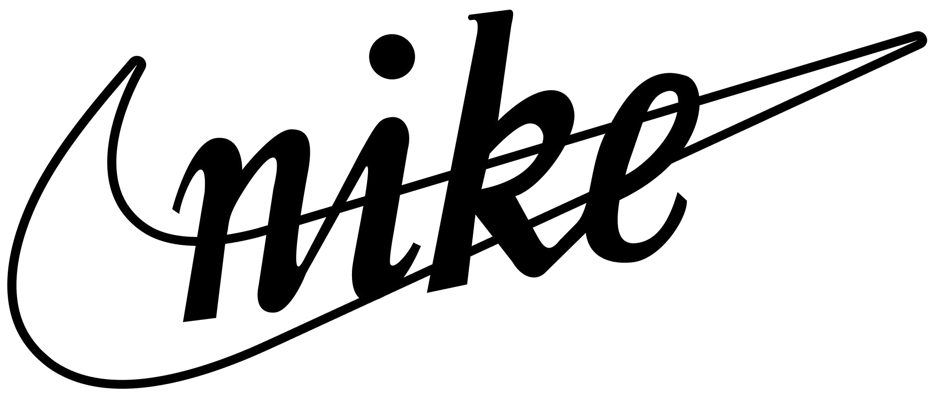
But simplification is also a confidence signal. A brand that drops its wordmark entirely — as Nike did in the mid-90s — is saying: we don't need to tell you who we are anymore. You already know. That kind of restraint is only available to brands that have done the years of work to earn recognition at the level of a single shape or stroke.
"The logos that endure are not the most clever ones. They're the ones that become more themselves over time — stripping away everything that isn't essential until only the idea remains."
Pattern 01 — The Simplification ArcWhat this means for your clients
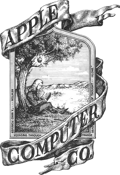
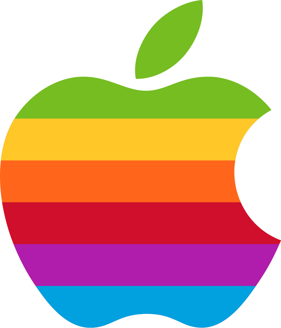
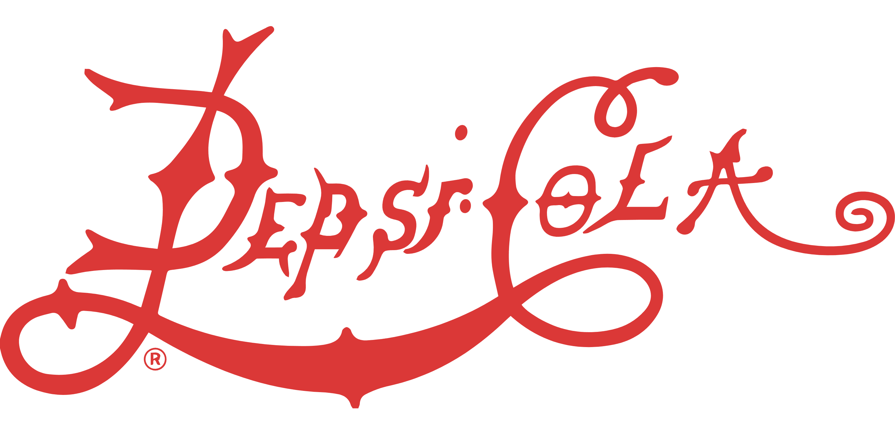
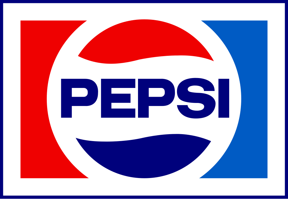
When a client says "we can't simplify — we'll lose too much," the historical record says otherwise. Apple simplified from a rainbow illustration to a flat silhouette and became the world's most valuable company. Nike removed their own name from their logo and became more recognizable, not less. Pepsi has simplified its wordmark three times, each time gaining in legibility and versatility.
The fear is that simplification means losing history or meaning. The evidence is that it means the brand has matured enough that the form can carry the meaning on its own. Complexity is often a sign of insecurity — the need to explain, to decorate, to justify. Simplicity is a sign of earned authority.
When to use this pattern in a pitch
This pattern is most useful when a client has a logo that's difficult to reproduce at small sizes, contains more than two colors, uses a complex illustration or crest, or relies heavily on a long wordmark. The Simplification Arc gives you historical precedent to argue that reduction is progression — not loss.
The strongest version of this argument shows the client's own logo history (if it exists) alongside two or three examples from other categories. The goal isn't to make them feel behind — it's to show them where great brands inevitably go, and invite them to get there on purpose rather than by accident.
Evidence · Three Brands, One Direction